 I got my SU! Color Coach today. I bought one because I started to doubt my ability to "get it right" I created a few cards that were just off when it came to color.
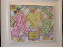
 Well, I have to hand it to SU! As I turned the dial, the color combinations made sense. One of them was for Apricot Appeal. This may be the first time I have ever used this color card stock. As I am not usually into pastels, it would not be one that I would reach for. However. I do like to combination with Certainly Celery and Lavender Lace. The Cameo Coral (also a color that I don't think I would ever pick independent of the CC, is a nice punch of color when paired with the others.
The other coordinating color that was listed was Bashful Blue. Unfortunately, I didn't have any BB ribbon. I grabbed the only ribbon that I had that was close. Bashful Blue ribbon would look much softer but it is not bad.
Hmmm...thinking of a combo using Old Olive next. I wonder what I will come up with?
Enjoy your day!


No comments:
Post a Comment